When Club Crests Moved from the Page to the Shirt
Club crests on shirts can unite supporters, but design, placement and meaning can cause friction. Learn how to read those choices with care.
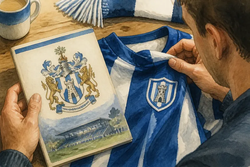
A supporter unfolds a shirt at the kitchen table and spots the club crest where a printed badge used to sit on a programme cover. The club crest on a shirt is more than a change of surface: it makes a mark once encountered on paper visible on the body, where questions of belonging, design and ownership become harder to ignore.
That shift did not happen in one clean leap from page to fabric. Clubs used emblems across printed matter, signage and kit in different ways, and the same mark could be simplified, recoloured or repositioned for each purpose. When people disagree about what a crest means, the source of the friction is often that they are looking at different versions—or asking one version to do too much.
Why does a crest look different across printed and worn forms?
Paper and cloth place different demands on a design. A detailed emblem can be crisp on a programme or membership card, yet its small lettering and fine lines may blur when stitched or reproduced on a moving shirt. A kit version may therefore use fewer details, stronger outlines or a different arrangement.
That adaptation can be mistaken for a break with tradition. It may instead be a practical response to the surface, production method or distance from which the mark will be seen. Compare the shapes and colours before judging the versions as competing statements.
- Look at the silhouette first: does the main outline remain recognisable?
- Compare the symbols and colours, allowing for a simplified kit rendering.
- Check whether the words are legible on the shirt, rather than assuming every printed detail should transfer.
- Notice the date and purpose of each item; a ceremonial badge and a playing shirt may have different design needs.
Say you have a programme with a detailed crest and a shirt with a simplified one. If the animal, shield and principal colours remain, the simplified version may be an adaptation rather than a rejection of the older mark. That distinction gives a conversation room to move beyond “real” versus “fake”.
What causes arguments about a redesigned badge?
A redesign can unsettle supporters because the crest carries associations that are not all visible in its lines. A local building, plant, animal or set of initials may recall a neighbourhood, a former name or a community tradition. Removing one element can feel like removing the story attached to it, even if the new badge is clearer on fabric.
There is also a difference between being able to recognise a symbol and feeling represented by it. A mark can work well as a compact graphic while seeming detached from the people who have carried its older version in memory. The club’s explanation may describe the design logic, but supporters may still want to know whose memories shaped the decision.
When discussing a change, be specific. Name the feature that matters to you and the association you connect with it; “the old one was better” gives others little to respond to. If you are listening, ask what the symbol recalls before defending the new design.
Why does the crest’s position on a shirt matter?
Placement changes how a badge is encountered. On a programme, it frames information and can be examined at leisure. On a shirt, it sits among the wearer’s other choices and is seen in movement, in a crowd or across a room. Its visibility can make affiliation legible before a supporter says a word.
That visibility does not mean every wearer intends the same message. Someone may choose a shirt for a family connection, a particular season or its design, while another wears it to signal allegiance. Avoid treating clothing as a complete account of a person’s relationship with a club.
Manufacturers and clubs also place crests according to the garment’s cut, sponsor marks and kit conventions. If the badge seems unusually prominent or out of place, compare it with other shirts from the same club and period. The surrounding layout often explains more than the crest alone.
How can supporters discuss a crest without flattening its meaning?
Start by separating three questions: what does the mark depict, how has it changed, and what does it mean to different supporters? Those questions overlap, but treating them separately helps prevent a design preference from being mistaken for a claim about who belongs.
It can also help to compare actual objects rather than rely on a remembered image. Put a programme, badge or old shirt beside the current kit if you have them. If not, describe what you recall as memory rather than presenting it as a precise record. Small differences in colour, lettering or outline can matter to the discussion.
Imagine a supporters’ group preparing a display that includes a printed emblem and a newer shirt crest. One member objects that the newer mark omits a local symbol; another says the simplified design is easier to recognise at a distance. They could label the two versions with their context and invite people to share what each element signifies, rather than forcing a single verdict on the display.
This approach does not require agreement. It makes room for the fact that a crest can be both a designed image and a shared possession, with different people attaching different histories to it.
What questions do people ask about club crests?
Why do some shirts use a simplified crest?
Fine details and small lettering can be difficult to reproduce clearly on fabric or at a distance. A simplified mark may preserve the main silhouette and symbols while adapting the design to the shirt.
Does a new crest replace the old one?
A club may adopt a new official design, but earlier crests remain part of its visual history. Old versions can continue to appear on printed material, collections and supporters’ clothing.
Why do supporters care about small changes?
A detail may connect the badge with a place, a remembered period or a community story. What looks minor to one person can carry a strong association for another.
Can a shirt crest mean different things to different people?
Yes. One wearer may see family history, another a connection to the club, and another may simply like the garment. The visible mark invites recognition without explaining the wearer’s whole relationship to it.
What should you check before calling a crest inauthentic?
Use a few simple checks before dismissing a version. They help distinguish a practical adaptation from a change that alters the emblem’s central identity:
- Find the context: is the mark on a shirt, programme, scarf or other item? Decide whether that surface calls for a different treatment.
- Compare the core features: note the outline, principal colours, initials and recognisable symbols. Decide which changes are cosmetic and which remove a meaningful element.
- Check the time period: a design may belong to a particular kit or stage in the club’s visual history. Avoid treating one version as the only one that has ever counted.
- Separate official use from personal use: a supporter’s vintage shirt can preserve a past badge without claiming that it remains the current design.
- Ask whose view is missing: if the issue is community representation, decide whose experience should be heard before settling on a judgement.
For the identity of the registered design, consult the club’s own current materials; where reproduction or merchandise rules matter, follow the relevant rights holder’s guidance.
The useful question is not simply whether a crest belongs on a shirt. Ask what changed as the emblem moved from page to body, and who can still recognise themselves in it. That question keeps the club crest on a shirt connected to the people who give it meaning, not only to the surface that carries it.